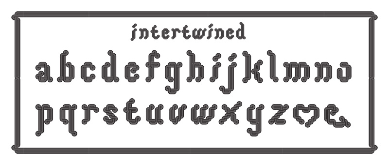
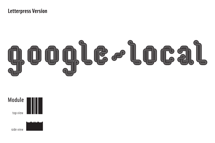
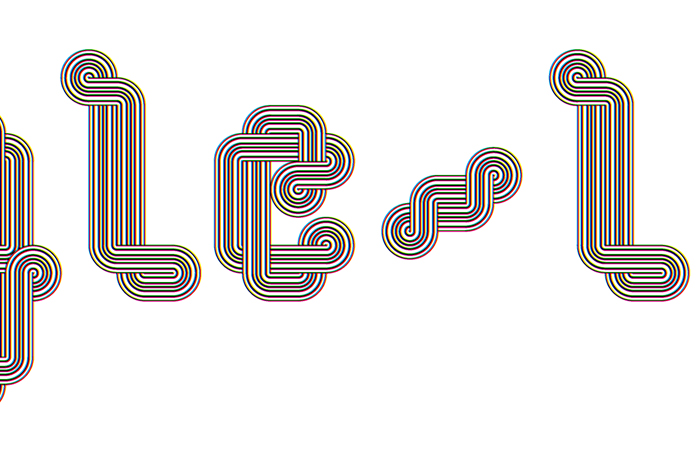
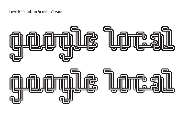
Intertwined Typeface, Media Specific
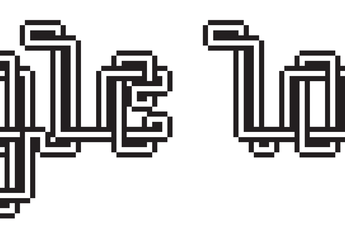
This typeface was originally designed as a project to to demonstrate relationships between the digital (illustrator & laser cutter) and the hand craft (letterpress). The original designs were for a poster to present at the NCSU Design Symposium at a round table discussion. I then became very interested in ways of creating a type family other than modifications in weight, italics/oblique. This typeface is designed as a family to respond to the mode of reproduction. Each font is specifically design to leverage a qulity that could only occur for the mode of reproduction in it was designed for. For example, the offset printing version is designed with such detail, that it will produce a moire patterns, and create overlapping colors that will change in relationship to the type of press, paper, and consistency of the inks used to print. While the letterpress version has a variety of edge types to create different debossing lines in the paper it is printed on.